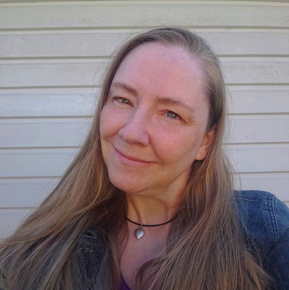
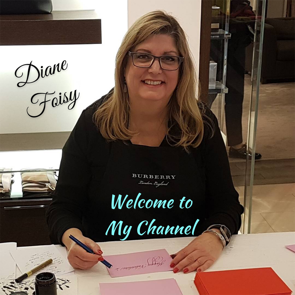
Meet our latest Artist of the Month...Calligraphy by Diane. Diane started her calligraphy jouney in 1977! Her passion for lettering and calligraphy was ignited as a young girl learning how to print. Read on to find out more about her fascinating journey...
What is your background and when did your passion for Calligraphy and Lettering begin?
My passion for calligraphy and lettering began when I was in grade one. You know when you receive that brand new exercise book in school, to begin learning how to print? Well I was so excited, I couldn’t wait to begin printing in that book with a pencil.
When I was in grade 3, that got even more exciting, as I was about to embark on learning cursive handwriting, with an inkwell in our desk, fountain pens and a blotter at hand. This was 1963, I was 7 years old and I loved it!
I was always made as an example in front of the class by the teacher on how well I could do cursive. I would be asked to go to the chalkboard, and demonstrate how to write a word on the chalkboard. I felt so good doing it, that when I returned to my desk, I would think to myself, what could I do with this? Maybe I could be a teacher?
In high school I spent many, many hours after school in the art room doing pages and pages of hand lettering with a brush. Racing ahead, I knew that all I wanted to do was to get that grade 12 diploma so I could go on and study art! That was where my focus was. I studied art in college, majored in advertising art, and absolutely loved all the arts. I double minored in photography and fabrics for the love of these art forms too.
During my 2nd year of college, I volunteered at a local TV station so that I could learn as much as I could on the job by helping out in their art department. Here is where I learned how to do Showcard lettering, also known as sign lettering with a brush that was called a quill. The TV station offered me a position there, but now I was in the middle of my third year, but I wanted to graduate first. Once I graduated, they hired me right away. The college where I graduated from, Sault College (which was like OCAD in Northern Ontario) hired me to teach their credit art program, Introduction to Advertising Art, as a professor for their Continuing Education Department. I enjoyed teaching as well. I was very fortunate to have both a full time position as an artist at the local TV station and an evening position as a professor teaching adults this course. Thus, I began my professional journey as an artist in 1977.
It was while I was studying art in college, that I saw another student doing certificates in calligraphy over a light table, seeing that, I completely stopped dead in my tracks. I was very drawn to it, and decided I wanted to do that too, but there was no such course taught in Art College. I bought my first calligraphy pen set a few years later for $3.99, and taught myself. This set came with broad edged nibs, and began learning the Chancery lettering style, also known as Italic.
Who / Where do you take your inspiration from?
My inspiration came from my mentor at the time, Mr. Bob Jenkins. He was a great artist, teacher, and mentor and later became a lifelong friend. He was the Art Director at Huron Broadcasting, where I was his protégé learning how to do lettering with a quill and art on the art boards. My passion for lettering really developed with this learning process while volunteering at the TV station and going to college, so by the time I began there full time in 1977, I was already groomed and ready to roll.
In the 70’s all the lettering and all of the art was done on these small art boards. We would place a frame on the board, to create the art and the layout inside of this area was suitable for a television screen. These completed art boards would be taken down to the photography department, and the images would be made into slides. The slides would be placed in telecine, and that is the image you would see on TV.
Television was a fun industry to work in, and I really enjoyed meeting all the fun people that would work there too.
What in your opinion is the hardest and the most rewarding parts of working in a creative industry?
I think the most difficult part of working in a creative industry was the mind-set of others. They would say that you cannot make a living as an artist. They had this mind-set that artists were poor, starving in fact. Nothing could be further from the truth. I knew I could make a living out of doing what I passionately love.
I just ignored the noise, and remained focused on serving others with what they needed done in art and calligraphy and the money followed. If you serve others above and beyond what they expect, you cannot help but experience expansion in your freelancing career or in the business as an entrepreneur. I did both. I freelanced from home when I was raising my babies, and later had businesses in the arts. I launched my calligraphy business, Calligraphy by Diane in 1999 and definitely made a living out of doing what I passionately love doing. The most rewarding moment for me is seeing the big smile that comes on my client’s face along with an avalanche of compliments spilling out, when presenting to them the completed piece they commissioned me to do for them. There is nothing like that moment. The money becomes a side thing, less important. But still needed to live!
Do you have a favourite style?
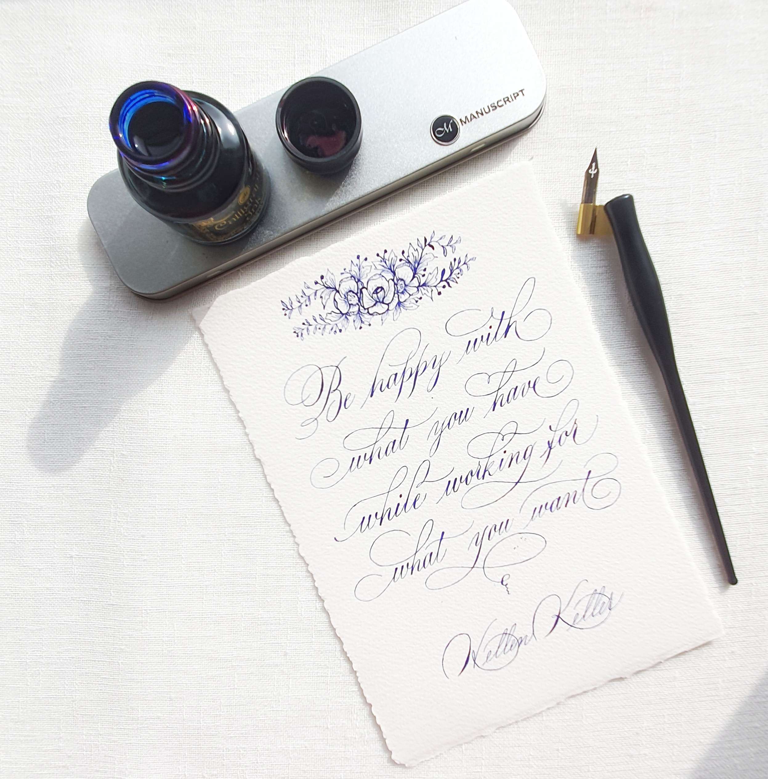
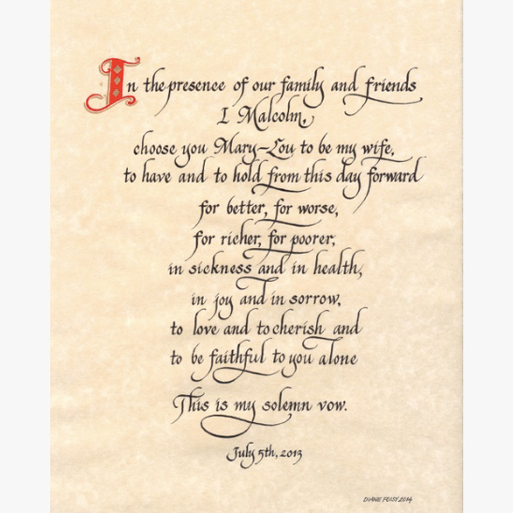
I absolutely love doing all styles of calligraphy, but I think my favourite style is Ornate Cursive. It is my own style that I created. Survey says it’s my clients’ favourite style too. It is a cross between Cursive and Copperplate. My father purchased this expensive pen for me, and I had the pleasure of meeting with a nib grinder Mr. Richard Binder, who came to Toronto for a pen show. He watched how I wrote, and grinded my nib to customize it to suit my penmanship. This is the pen that I used to do this style and still use it often to this day.
But in all honesty, I began my calligraphy journey with a Sheaffer broad edged nib in that $3.99 pen set, and taught myself the Chancery lettering style, also known as Italic. I got very good at this one style and started my calligraphy business with this one style. Then I broadened my learning skills and taught myself to do any lettering style and in any language.
What are the most exciting projects you have worked on and what are you working on at the moment?
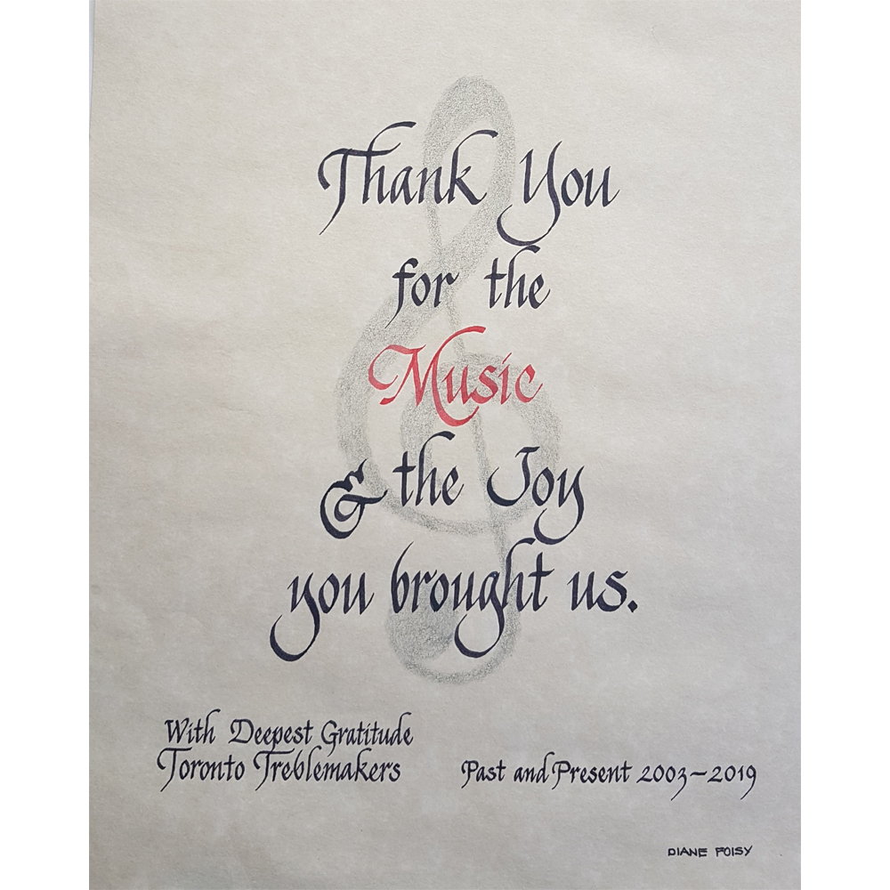
I have serviced many commissioned projects by FORTUNE 500 corporate clients such as Chanel, Tiffany's Co., Montblanc, Cartier, Burberry, Holt Renfrew, Louis Vuitton, Club Monaco, The Bay, SAKS, to name a few. I also serviced a high volume of certificates and awards for the Ontario College of Chiropractors, Environmental Printing Awards, The Miller Thomson Foundation Scholarships, Ontario Lacrosse Association, World Federation of Chiropractic, and Canadian Songwriters Hall of Fame to name a few.
Events for the VIPs at the TIFF (Toronto International Film Festival) and inscribed in CNE book that was used for the opening ceremonies of CNE (Canadian National Exhibition) for well over 100 years. It was both an honour and privilege to contribute my art and calligraphy in this book that will be around, long after I am gone. My calligraphy has also been commissioned as TV props for television productions for Hannibal, The Green Room, Covert Affairs and What We Do In The Shadows Season 3. Prestigious families such as The Weston's and The Black's Residence have also commissioned me for their personal events.
I have also done a high volume of weddings, events, personal projects such as poems, vows, family trees, love letters, and letters of gratitude to name a few. Projects were created in high volume for presentation pieces in calligraphy for retiring CEO’s and World War II members of the McCarthy and McCarthy Law Firm in Toronto.
I have inscribed beautiful guest books for the City of Toronto and for the Ontario Government in Toronto to welcome prestigious visitors to the City and to the province.
The most exciting project I have ever worked on was the handwritten letters, in the Ornate Cursive style, on set on behalf of Hannibal, the TV series. It was also challenging. I had the camera beside my face, and the director didn’t want me to show my female hand, as this to replace the hand for Hannibal, who was a male, so I had to choke up on the barrel of the pen so that my hand could not be seen and write like that. Very challenging I must say, but I absolutely loved being there on set with the actors and the set itself was incredible. I guess this would stem from the love I had with television where I began. I did all of the letters, envelopes and all of the props for the whole series of Hannibal. That to me was most exciting.
At the moment I am working on certificate awards for a karate school with different black belts rankings; a wedding invitation design, along with recording lessons for my membership.
Recently I completed a family tree update, and created poems. It’s a busy calligraphy studio!
How does your work relate to your everyday life?
Well I used to work 7 days a week, all hours of the day and night, but now that I am getting on in my years, I try to have some down time here and there to refuel especially with nature. I think it is important to have a balance between work and time with family. I have been doing calligraphy since 1977 and built from scratch my calligraphy business since 1999 and for the past few years I have been focusing on creating more of an online presence, selling my courses all over the world so that I can help more people to learn this art form. I have all of this knowledge and experience as a calligrapher, and know how to start and run a calligraphy business so that you could make a living out of what you passionately love doing. My goal right now is to pass on that baton and together we can keep this art form alive. That is why I am selling my calligraphy lessons as digital courses, and now offering a membership to allow a person to take the journey as a beginner starting with the cursive handwriting, right on through to becoming a master calligrapher.
What are your favourite tools to use?
My favourite tools are the Manuscript fountain pens and all of the broad edged nibs. Pointed nibs to do the Ornate Cursive style, brush pens, and love combining in watercolour, gouache paints, brushes, metallic gold, silver, copper Pen-Touch (extra-fine). Fine pointed nibs that have a nice bend in the nib are wonderful to work with and experience. They give a very nice fine line and thick strokes when applying a bit of pressure. Beautiful to work with.
What would your advice be to people new to the creative industry and any tips on how to get started?
My advice to people who are new to the creative industry is go with your heart, follow your vision on what you want to create as your means of making a living. If you have people who have negative views around you, disconnect from them. Ignore those comments like, ”Why don’t you get a “real job”. Surround yourself with like-minded creative people, or people who love what you do and not only will you achieve your dreams, but you will be much happier too. Find yourself a mentor or other successful artists who are doing well with their art so you can learn from them too.
My tip to get started….do your own marketing survey to see if there is a market in your area for your creative idea before you put time and energy into creating the business. You want to make sure it is an item that people want or need and are willing to pay for. Specialised niches are best!
Do well in whatever you do, and I welcome you to follow me.
To see more of Diane's work you can follow her on Instagram or visit her website for helpful calligraphy videos. Remember to follow @manuscriptpenco on Social Media where we will be showcasing her work throughout the month.


